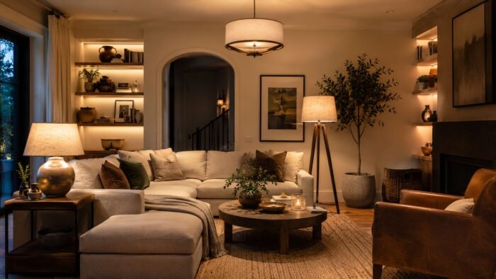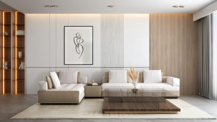
Wall art is where most otherwise-nice rooms quietly fall flat. The art is hung too high, scaled too small for the wall, or scattered without a plan, leaving a room that feels unfinished no matter how good the furniture is. The fixes are simple and mostly free, because good wall art is less about expensive pieces than about correct size, height, and arrangement. Whether you want a single statement piece or a full gallery wall, a few rules will make your walls look considered rather than accidental.
Like choosing a correctly sized rug, the most common mistake here is going too small. Bare walls and tiny, lonely frames are the giveaways of a room that was never quite finished.
Get the height right
The single most common error is hanging art too high. The center of a piece, or the center of a grouping, should sit at roughly eye level, about 57 to 60 inches from the floor, the standard galleries use. Over furniture, the art should relate to the piece below it rather than float near the ceiling: leave only a few inches between the top of a sofa or console and the bottom of the frame. When art drifts upward, the wall looks top-heavy and disconnected; bringing it down to eye level instantly settles the room.
Scale art to the wall
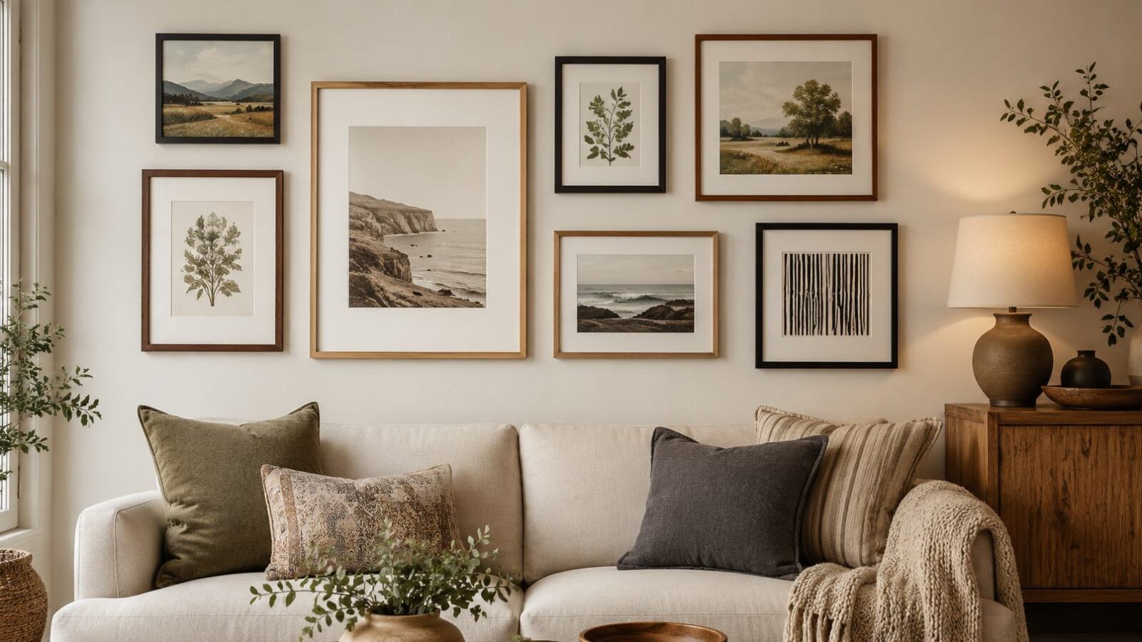
A piece of art, or a grouping, should fill roughly two-thirds to three-quarters of the available wall or the furniture below it. A small frame on a large wall looks stranded, the wall-art version of the postage-stamp rug. If you only own small pieces, group them so the cluster reads as one larger shape. Over a sofa or bed, aim for the arrangement to span most of the width of the furniture rather than a lonely picture in the middle.
Planning a gallery wall
A gallery wall looks effortless but rewards a little planning. The reliable method:
- Gather your pieces and decide on a unifying thread, whether matching frames, a color palette, or a consistent theme, so the mix feels intentional.
- Lay the arrangement out on the floor first and rearrange until it works, before a single nail goes in.
- Trace each frame onto paper, tape the templates to the wall, and step back to judge spacing and height.
- Keep consistent gaps between pieces, roughly two to three inches, so the group reads as a unit.
- Hang from the center outward, checking as you go.
The floor-and-paper step is what separates a crisp gallery wall from a wall full of mismatched holes.
Choosing art you will not tire of
You do not need expensive originals. Prints, framed textiles, photography, and even well-framed objects all work, and mixing types adds interest. Choose pieces that suit the warm, layered direction of current interior design and that genuinely appeal to you, since you live with them daily. Coordinating frames or matting ties a varied collection together, and leaving some breathing room around art is as important as the pieces themselves.
Hanging it without wrecking the wall
Use the right hardware for the weight and your wall type, and use two hooks rather than one for anything wide so it stays level. Measure twice before drilling, since extra holes mean extra patching. If you do end up with stray holes from a change of plan, they are an easy fix, covered In the guide to repairing drywall holes and cracks, so do not let fear of a mistake keep your walls bare.
Frames, matting, and mixing media
The framing does as much as the art itself, and a few choices keep a varied collection looking deliberate.
- A generous mat border makes even a modest print look gallery-worthy and gives the eye room to rest.
- Consistent frame colors or finishes unify pieces of different sizes and styles into one collection.
- Mixing media, prints, photos, textiles, and the odd three-dimensional object, adds interest a row of identical frames lacks.
- Match the frame style to the room rather than the art: simple, slim frames suit most modern interiors.
When in doubt, keep the frames quiet and let the art and the arrangement do the talking.
If you take nothing else from this, lower your art. The most common and most fixable decorating mistake in homes everywhere is art hung a hand-span too high, hovering between the furniture and the ceiling. Bring the center to eye level, scale it up to fill the wall, and even modest prints will look intentional. It costs nothing but a few minutes and a willingness to fill an old hole, and it transforms how finished a room feels.
Gallery wall questions before the first nail
How high should I hang wall art?
So the center sits at eye level, roughly 57 to 60 inches from the floor. Over furniture, keep the bottom of the frame just a few inches above the sofa or console so the art relates to it.
How big should art be over a sofa?
The art or grouping should span about two-thirds to three-quarters of the sofa’s width. A single small piece centered over a wide sofa looks stranded; scale up or group several pieces.
How do I plan a gallery wall?
Lay the pieces out on the floor first, settle on a unifying thread, then trace the frames onto paper and tape them to the wall to test spacing and height before hanging anything.
Should all the frames match?
They do not have to, but they need something to tie them together. Matching frames give a clean, formal look that is hard to get wrong, while mixed frames feel more collected and personal but rely on another unifying thread, such as a consistent color palette, a shared theme, or uniform matting, to stop the wall looking random. A reliable middle path is to vary the art freely while keeping the frames in a limited set of finishes, which lets a diverse collection read as one intentional grouping rather than a jumble.
What makes a gallery wall feel unsettled
- Hanging art too high instead of at eye level, around 57 to 60 inches to the center.
- Choosing pieces too small for the wall or furniture below them.
- Hanging a gallery wall straight onto the wall without planning the layout first.
- Inconsistent gaps and no unifying thread, so a grouping looks random.
- Using a single hook on a wide frame, leaving it perpetually crooked.
A gallery wall needs rhythm more than symmetry
Great walls come down to height, scale, and arrangement, not expensive art. Hang pieces at eye level, scale them to fill the wall or furniture, plan gallery walls on the floor before drilling, and use proper hardware. Follow those rules and ordinary prints will make a room look finished, while ignoring them leaves even good art looking like an afterthought.